SANTO ADRIAO
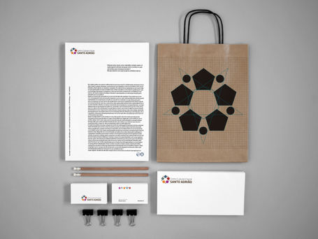
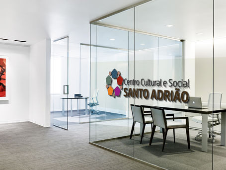
As creative Director for the “design is needed” campaign I made a completely new design for the social and cultural entity of the city of Braga. This new brand had to embrace 5 other brands as a mother logo. This made me develop a logo that could be decomposed in 5, five corners, five colors and that is why I chose the pentagon. All the other brands represent their purposes inspired by items related to the business they are implicated, as elders, child care, social work, recreation/ culture and sports.
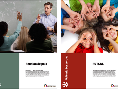
The company laked unity in visual communication, and my project helped in that field, creating a continuity and basis for the brand to evolve and develop.
As an action for the “design is needed” campaign I made a completely new design for the social and cultural entity of the city of Braga. This new brand had to embrace 5 other brands as a mother logo. This made me develop a logo that could be decomposed in 5, five corners, five colors and that is why I chose the pentagon. All the other brands represent their purposes inspired by items related to the business they are implicated, as elders, child care, social work, recreation/ culture and sports.
The company lacked unity in visual communication, and my project helped in that field, creating a continuity and basis for the brand to evolve and develop.


